As part of my migration from Drupal 7, to a new Drupal 11 / Astro / Remark setup, I felt it was also a good time to review the accessibility of the site.
I hadn't touched the look a feel of this website for years, and I have to admit accessibility wasn't something I had a huge amount of concern about when I first built it. Since then it's something that's built into all the work I do professionally, so it seemed only right to practice what I preach and get my own website up to scratch!
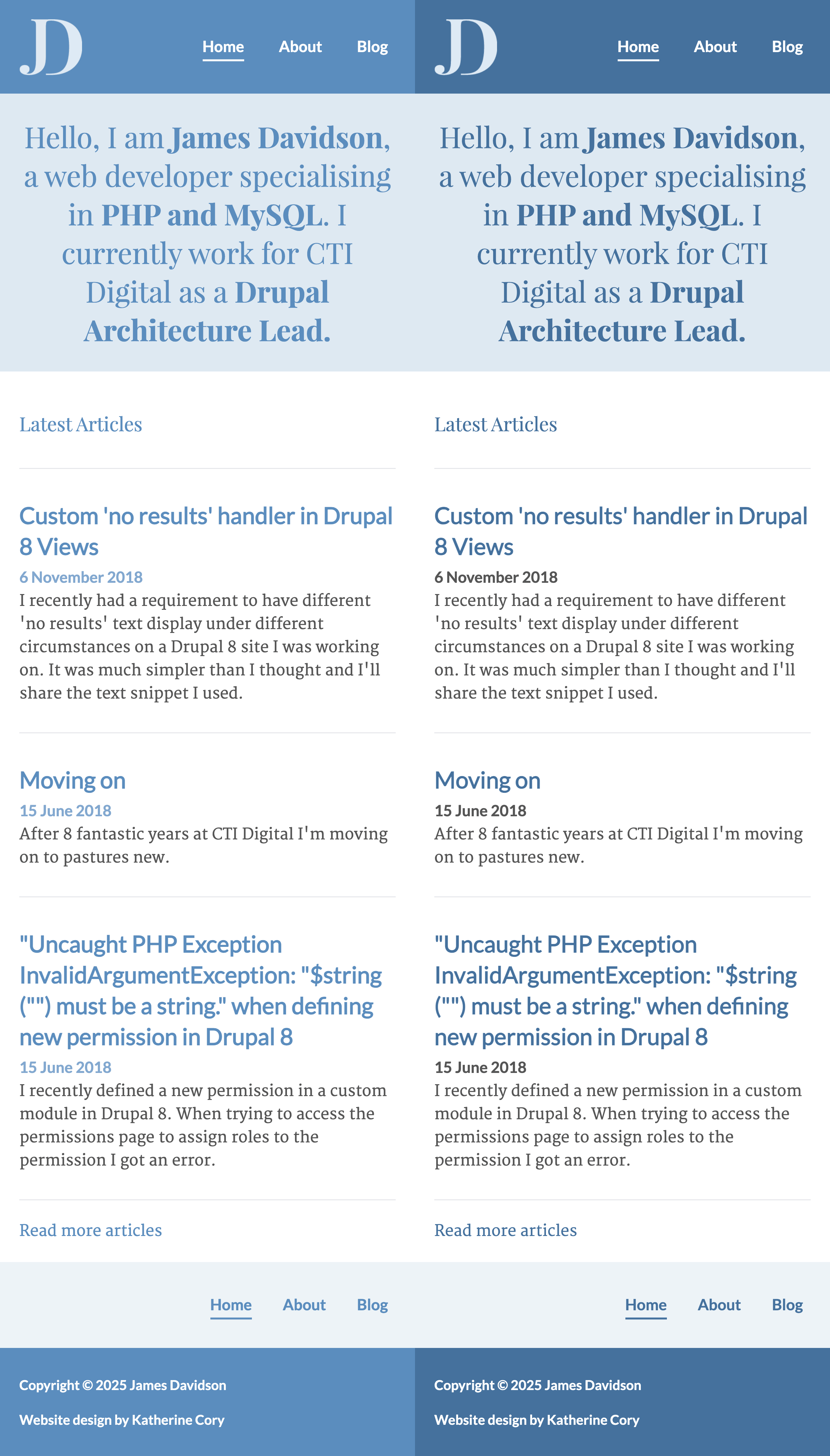
The main issues were text legibility. The original colour scheme used a slightly lighter blue, and that meant the contrast wasn't strong enough - both when it was used for text colour, or as a background with white text on top of it. I also ditched a very light blue that I was using, instead opting for grey for the blog post dates.
I feel like overall the site doesn't look quite as sharp as it did with the previous colour scheme - but that is much less important than everyone actually being able to use it.
Here is a side-by-side, firstly showing the old theme, and then the new one.

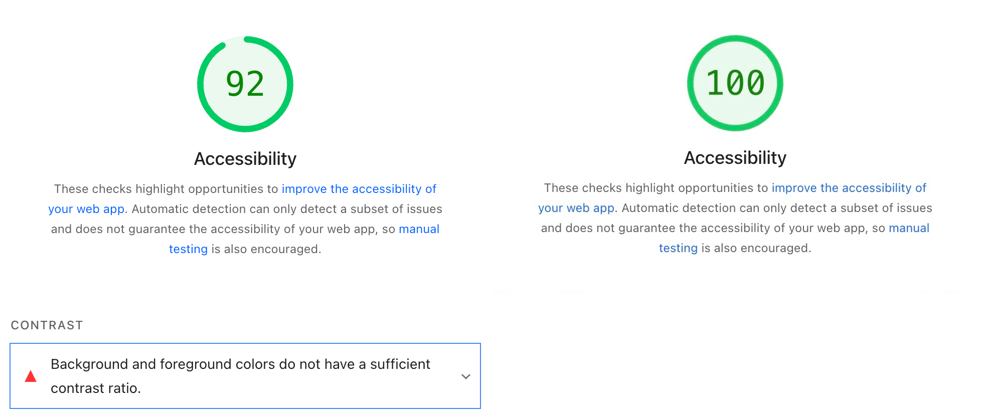
These are the accessibility scores from PageSpeed Insights before and after the changes.

I still have a couple of issues on other pages (heading hierarchy on the blog listing page, and links relying on colour to be distinguishable inside of articles), so I have a little way to go yet. But it's nice to working towards making my own site fully accessible.